10 September 2014
How We Designed a Responsive Email Newsletter
A year ago we decided to create an email newsletter for Gaslight. I jumped into MailChimp, modified a template and added a photo at the top. Boom, the Gaslight email newsletter was born.
Today we often rack up double the industry averages for both open and click through rates. Since the prototype email design was such a success, we decided to create a more intentional design that integrates with our brand and makes it easier for subscribers to read the content on mobile devices.
Step 1: Find a Responsive Email Template
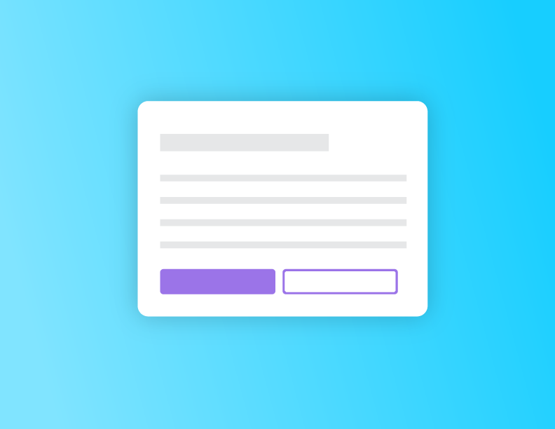
One of the biggest downfalls of our first design was the lack of a responsive email template. MailChimp now offers some responsive email templates, but it was time to create more customization. I settled on Zurb’s Ink. We’ve used Foundation in the past, and I felt familiar with the terminology and structure. I downloaded a template and edited it with only minor frustrations.
The grid is slightly different from Foundation, but the documentation was very thorough. After I was done, Ink provided a CSS inliner that did the work of inlining my CSS. This allowed me to separate my CSS and HTML while working on the template.
Step 2: Integrate MailChimp Editing Language
One of the biggest advantages of MailChimp is the drag and drop format. It allows our content strategist Michelle Taute to easily manipulate the copy and images each month. She also takes advantage of MailChimp’s built-in analytics to optimize the content based on user behavior. And this set-up means neither one of us has to edit HTML when we send an email blast.
All these benefits sent me wading into MailChimps’s template language. It was a little overwhelming at first, but I quickly discovered that it’s actually pretty easy. Simply drop “mc:edit” into the element you want to be editable then give it a custom name. Once I uploaded the template to MailChimp, I was able to click on these elements and modify the content. A big thumbs up to MailChimp for making this process painless.
Step 3: Testing the Design
MailChimp has some built-in email client tests, but I turned to Gaslight’s Litmus account, which I’ve used in the past. If you’re unfamiliar with Litmus, it gives you an address to send your test email then creates screenshots of how your design looks in different email clients.
Overall, my design turned out passable. Most of the clients rendered the email well, but a few had problems. The biggest offenders? Outlook 2013, 2010, and 2007. Big surprise. I had a lot of issues with spacing as those email clients pushed the stacked boxes off center. I also struggled with the Gmail app on mobile rendering the desktop version of the email. None of these issues were deal breakers, but I do want to fix them as we continue to iterate on the design. If anyone has fix ideas, please let me know!
I’m probably 80 percent satisfied with our new responsive email. It’s an improvement over the old newsletter, but there are definitely things we can work on. I’m hoping to clean up one problem a month and expand our responsive email template selection for more specialized messages.
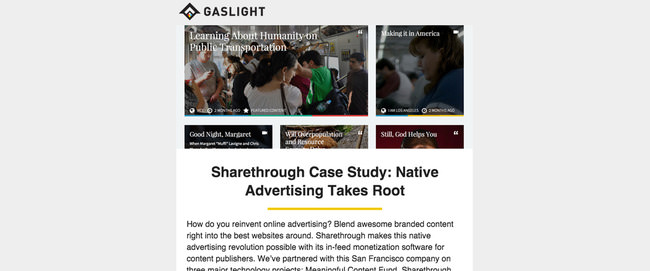
Want to see the new design in action? And follow along with my improvements?