1 April 2019
So You’re Building an Application With No Designer? Here's 3 Ways to Know the Usability is Suffering
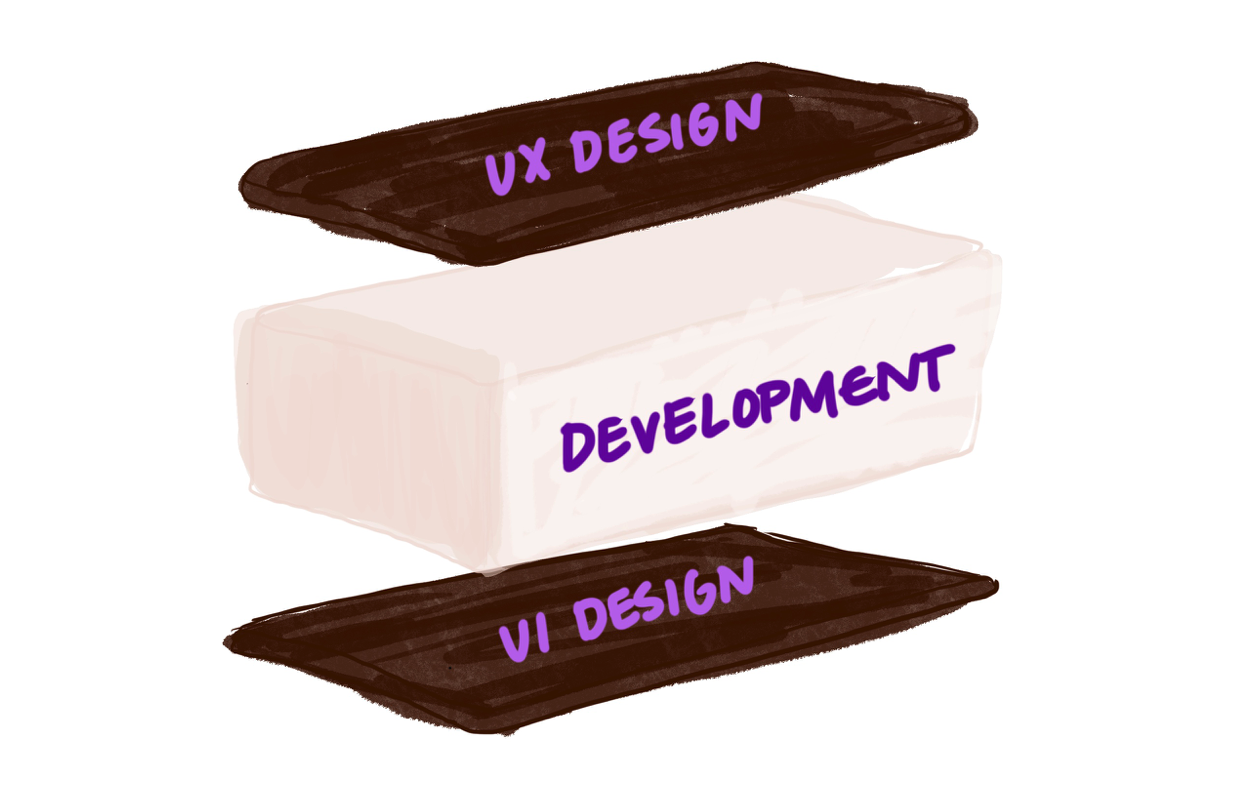
Not long ago, my fellow designer Haley wrote an excellent blog post, “Design happens whether or not you value it - ignoring it can ruin your project”. She laid out a good explanation of what design is and argued why it matters. But understanding the importance of design within an application is just the first step in improving it.
Poor UX has Consequences
Identifying what is wrong or missing in an application can be challenging. And if you’re not intentional about your user’s experiences, then the UX might be costing you more than you realize. It can affect your goal conversions and user efficiency. You know…stuff that affects the purpose of having a website or application in the first place.
So maybe you are not able or not ready to bring a designer onto your project. Here are three problems to be aware of, and could indicate you have several more ..
Usability Problems to look for:
Visual Hierarchy
My former art director would always quote Incredibles, “When everybody is super, no one is!” This also applies to the content and components in your application. There is nothing more deadly to a layout than the poor visual hierarchy. Users will not know what to look at, no clear path to navigate the content, and the calls to action will be drowned out by everything else.

Signs of poor visual hierarchy:
- Do your
<h>tags clearly scale down in size, color, and weight? - Is there very little white/negative space? Do your page elements butt up against the edges of the page and/or next to each other?
- Can you not tell what elements are clickable?
- Can you not tell what content is the most important?
- Can you not find the navigation in under 5 seconds?
Inconsistency
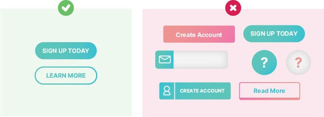
This is usually an easy problem to recognize. Elements or components that share the same functionality, but look or act completely different only confuse your user. I know this sounds crazy, but when a user sees an element that looks different from other elements, they inherently expect it to act differently. A simple design inventory of a type of component, like a button, will quickly reveal how consistent your application is. If they vary in color, size, shape, and in how they interact, then you have a usability problem.
Signs of inconsistency:
- Compare elements that do the same thing. Do they not look and act the same way?
- Do your animations not have the same timing and feel?
- Do you use different copy to direct the user to the same action?
Accessibility
Accessibility is such an important part of what we do. It is so often overlooked because we typically browse our own application the same way every day. Unless you personally know every possible user of your application, chances are you have of users with different needs.
Signs of poor accessibility:
- Do you not have alt tags on all your images?
- Use a color blind app to view you app, like Chromatic Vision Simulator. Do any of the colors blend together?
- Does your content not make sense when using a screen reader on your page?
Can you guess the next step?
There are many more issues that can arise from the lack of attention to design details on a project. If you found one of the problems above, chances are there are a few more. I think you know what I am going to say next. These problems are fixable with the help of a trained designer. And we may know a company with a few experienced designers who can help you out…